Design a website for Cucina Di Vita that allow users to both reserve a table at a restaurant the has an authentic Italian atmosphere, and/or the ability to order various delicacies to home.
Challenges
Some restaurants don’t have an elegant, classy Italian atmosphere that is also warm and welcoming.
Most great restaurants don’t provide food ordering to home options.
Ensure the user flow is seamless and attractive.
Providing the user with an engaging experience throughout the flow process.
Starting line
In this project, I took an approach that proved to be quite effective in my design effort. I found qualitative research methods to be most useful, consisting of research, competitive analysis, stakeholder interviews, and most importantly our person hypothesis construction. I started asking myself some initial questions.
“What is the product and who is it for?”
“What do our primary users need most?”
“Which users are most important to the business?”
“What challenges could I face moving forward?”
“Who do we see as our biggest competitors?”
“What literature should I review to familiarize myself?”
I conducted a secondary research on Italian food lovers and Italian restaurants both inside and outside of Egypt and I have also conducted selected interviews to understand the users.
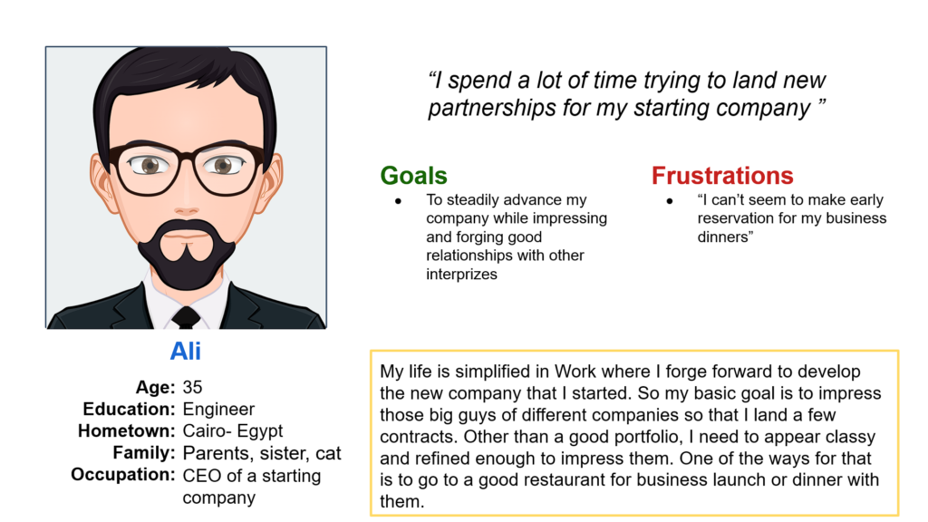
The primary user groups were working adults who are either a manager or CEO of a company or Italian food lovers who participate either actively or passively in social media food groups.
This user group confirmed initial assumptions about Italian restaurant customers, but research also revealed that money was not the only factor limiting users from going to restaurants.
Other user problems included obligations, interests, or challenges that make it difficult to find time or energy to go to restaurants.
Meet the users
Competitive Analysis
I looked at several potential competing establishments and found that they can infringe on the business’s revenue and popularity. Cucina Di Vita restaurant has the opportunity to capitalize on this by bringing ideas from each company to create the go-to place without oversaturating the users.
Starting the journey
The goal of the site map is to provide a clear navigation hierarchy and site structure to meet the users’ expectations and improve navigation through the website.
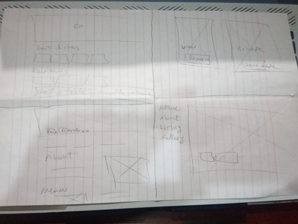
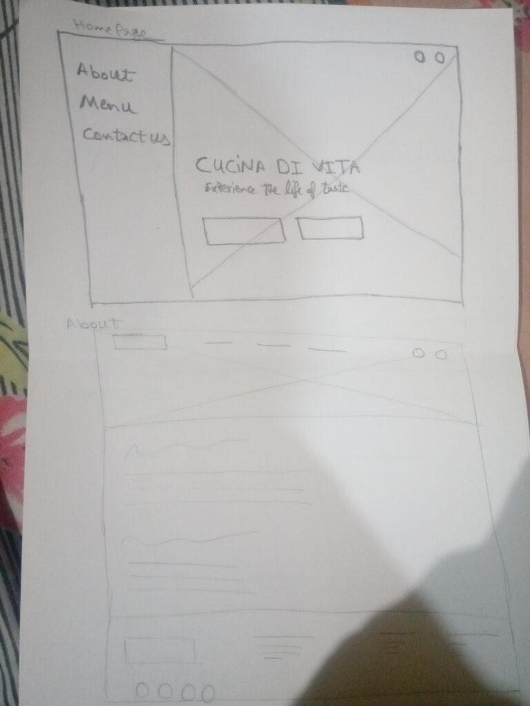
I sketched ideas that I imagined could work for the restaurant keeping the user’s pain points about the product and the process in mind.
The home screen paper wireframe variation on the right focus on optimizing the feel and different options of the restaurant.
Iteration
At this point, I had received feedback on my designs from stakeholders about things like the need of visual cues for the tables reserved and the absolute need for there to be direct statement for reservation fees and availability of reservation cancelation. I made sure to listen to their feedback, and I implemented several suggestions in places that addressed user pain points.
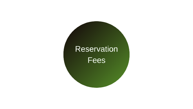
Once at the payment checkpoint, users hesitated to proceed because there was no clear statement of reservation fees.
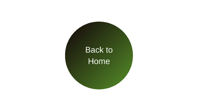
After completing the reservation or food ordering, users couldn’t head back to the landing page.
When choosing where to seat in the restaurant, users were confused about which table had a better view.
Challenge 1:
Based on the insights from the usability study, I made changes to reservation flow to clearly state the reservation fees and cancelation process and add the dress code for the restaurant and the rules for children behavior.
Challenge 2:
Based on the insights from the usability study, I made changes to the logo of the restaurant to allow those who click on the logo to be directed to the landing page of the website
Challenge 3:
Based on the insights from the usability study, I made changes to the table selection process to provide a picture for the scene of any selected table to improve the user experience and increase the engagement by providing a focal point.
Style Guide
Taking the primary color as Basil indicates we care that the food we provide is healthy for the body, with the black text, header & footer background to represent the luxurious atmosphere. and the basil variation complementing the text and buttons when not in action state to complete the picture of the perfect dish.
Takeaway
I learned that even a small design change can have a huge impact on the user experience. The most important takeaway for me is to always focus on the real needs of the user when coming up with design ideas and solutions.
We use cookies on our website to give you the most relevant experience by remembering your preferences and repeat visits. By clicking “Accept”, you consent to the use of ALL the cookies.
This website uses cookies to improve your experience while you navigate through the website. Out of these, the cookies that are categorized as necessary are stored on your browser as they are essential for the working of basic functionalities of the website. We also use third-party cookies that help us analyze and understand how you use this website. These cookies will be stored in your browser only with your consent. You also have the option to opt-out of these cookies. But opting out of some of these cookies may affect your browsing experience.
Necessary cookies are absolutely essential for the website to function properly. These cookies ensure basic functionalities and security features of the website, anonymously.
Cookie
Duration
Description
cookielawinfo-checkbox-analytics
11 months
This cookie is set by GDPR Cookie Consent plugin. The cookie is used to store the user consent for the cookies in the category "Analytics"./*54745756836*/
cookielawinfo-checkbox-functional
11 months
The cookie is set by GDPR cookie consent to record the user consent for the cookies in the category "Functional"./*54745756836*/
cookielawinfo-checkbox-necessary
11 months
This cookie is set by GDPR Cookie Consent plugin. The cookies is used to store the user consent for the cookies in the category "Necessary"./*54745756836*/
cookielawinfo-checkbox-others
11 months
This cookie is set by GDPR Cookie Consent plugin. The cookie is used to store the user consent for the cookies in the category "Other./*54745756836*/
cookielawinfo-checkbox-performance
11 months
This cookie is set by GDPR Cookie Consent plugin. The cookie is used to store the user consent for the cookies in the category "Performance"./*54745756836*/
viewed_cookie_policy
11 months
The cookie is set by the GDPR Cookie Consent plugin and is used to store whether or not user has consented to the use of cookies. It does not store any personal data./*54745756836*/
Functional cookies help to perform certain functionalities like sharing the content of the website on social media platforms, collect feedbacks, and other third-party features.
Performance cookies are used to understand and analyze the key performance indexes of the website which helps in delivering a better user experience for the visitors.
Analytical cookies are used to understand how visitors interact with the website. These cookies help provide information on metrics the number of visitors, bounce rate, traffic source, etc.
Advertisement cookies are used to provide visitors with relevant ads and marketing campaigns. These cookies track visitors across websites and collect information to provide customized ads.